Top Interior Design Colours for 2022
After a year of “Brave Ground” being the number one choice for Dulux, 2022 is surprising us with some exciting collections from the major paint manufacturers. This year promises us an emergence from the safety of our caves with a braver outlook towards Bright Skies and more daring colour schemes throughout the home.
Summery shades
Pantone was a little ahead of its time with Illuminating, a bright yellow chosen as the colour of 2021 and paired with Ultimate Grey.
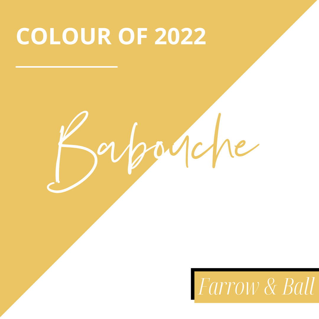
Farrow and Ball have been inspired to bring out not one, but five interior design colours including a muted yellow for 2022 called Babouche, which takes its roots in the leather Moroccan slippers that can be seen in souks and on the streets of North Africa where strong colours make up the cultural landscape.
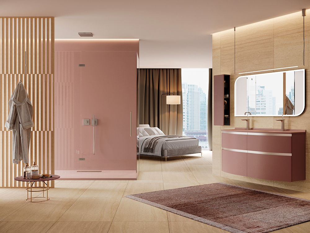
Pinks are also taking a leading role in 2022, but not Baby Pink. Rather we’re reclaiming pink from Barbie and upgrading its interior design status.
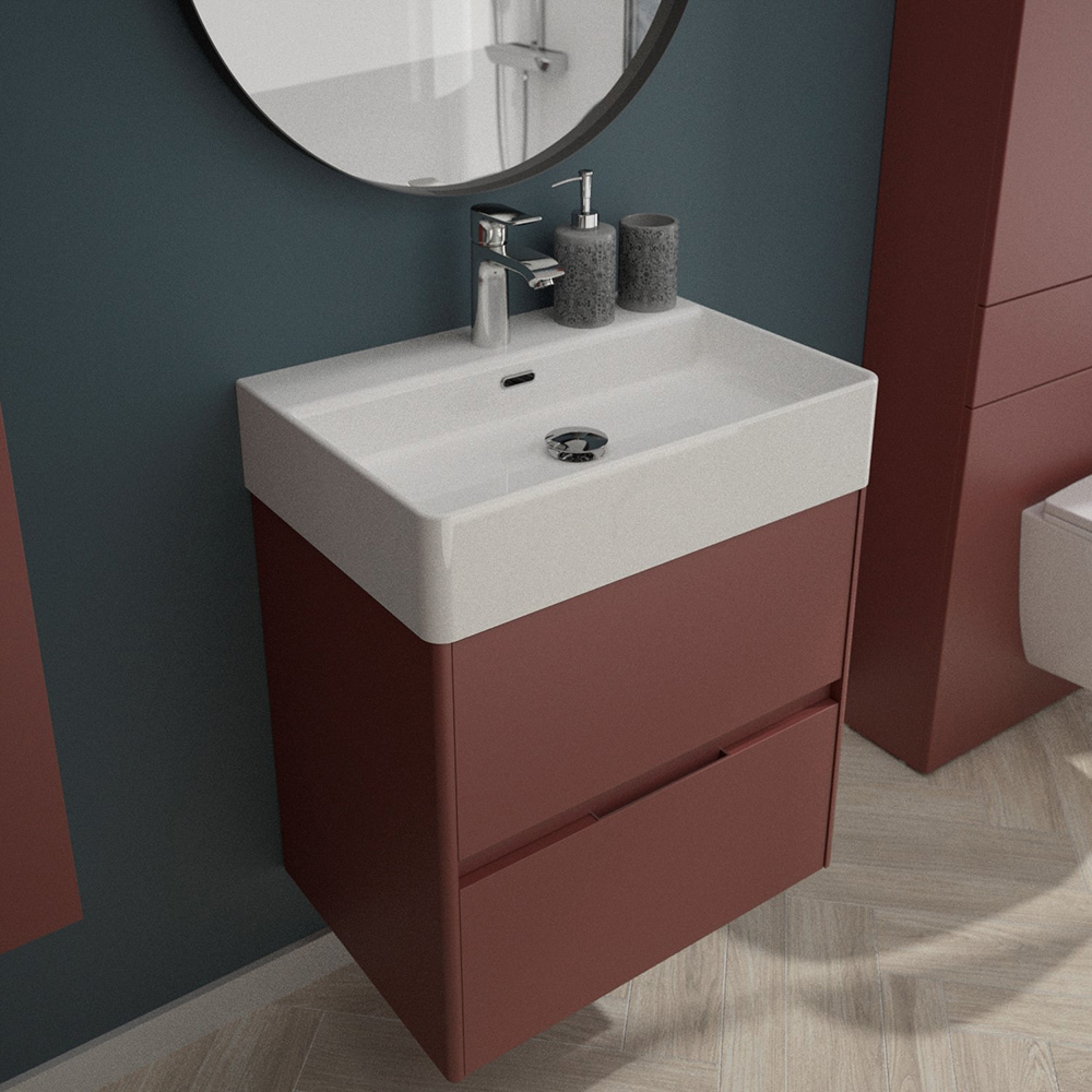
Pompadour is one of our top-selling colours for our modular and fitted furniture collections and is the perfect way to brighten a bathroom up.
It’s all about the blues
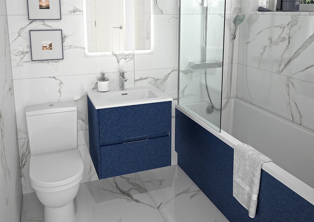
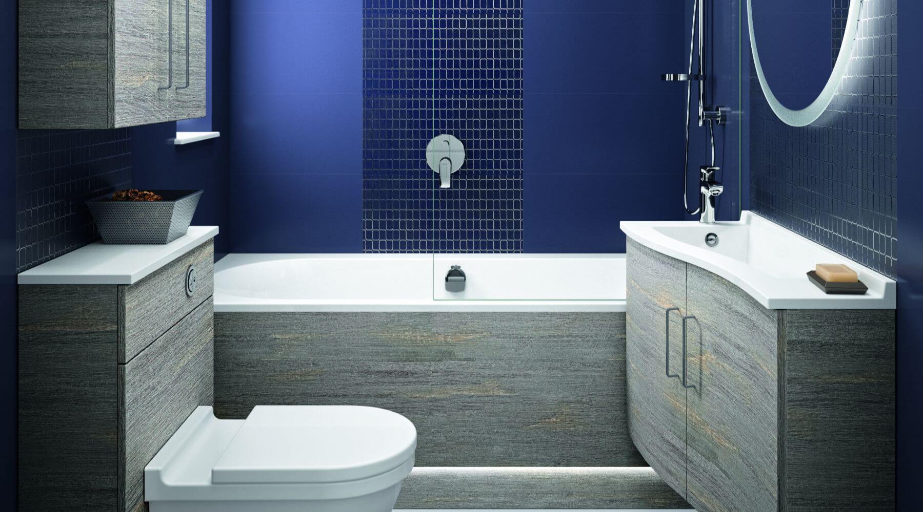
Blue is a mainstay of the interior design world, but there are so many blues that each year will offer something new.
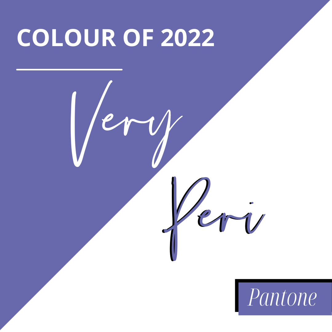
Pantone have decided to go all in with Very Peri, a striking dark lilac. This will be a great addition to skirting boards, doorframes and window ledges, but for the most committed, walls and ceiling could match too. Imagine pairing this with a white worktop?
Bright Skies is a sky blue that’s a little less attention-grabbing. It’s happy to take a back seat as a light neutral while other elements own the centre stage, yet it is still an optimistic step away from Brave Ground.
Stone Blue is Farrow & Ball’s blue of choice – a sophisticated shade reminiscent of Air Force Blue that makes a subtle impact without stealing all the limelight.
70s Colour Palette
Some designers are predicting a return to 70s interior design colours featuring ochre, terracotta and oranges, and we can see that Farrow and Ball’s Incarnadine paired with Babouche certainly achieves that retro feel.
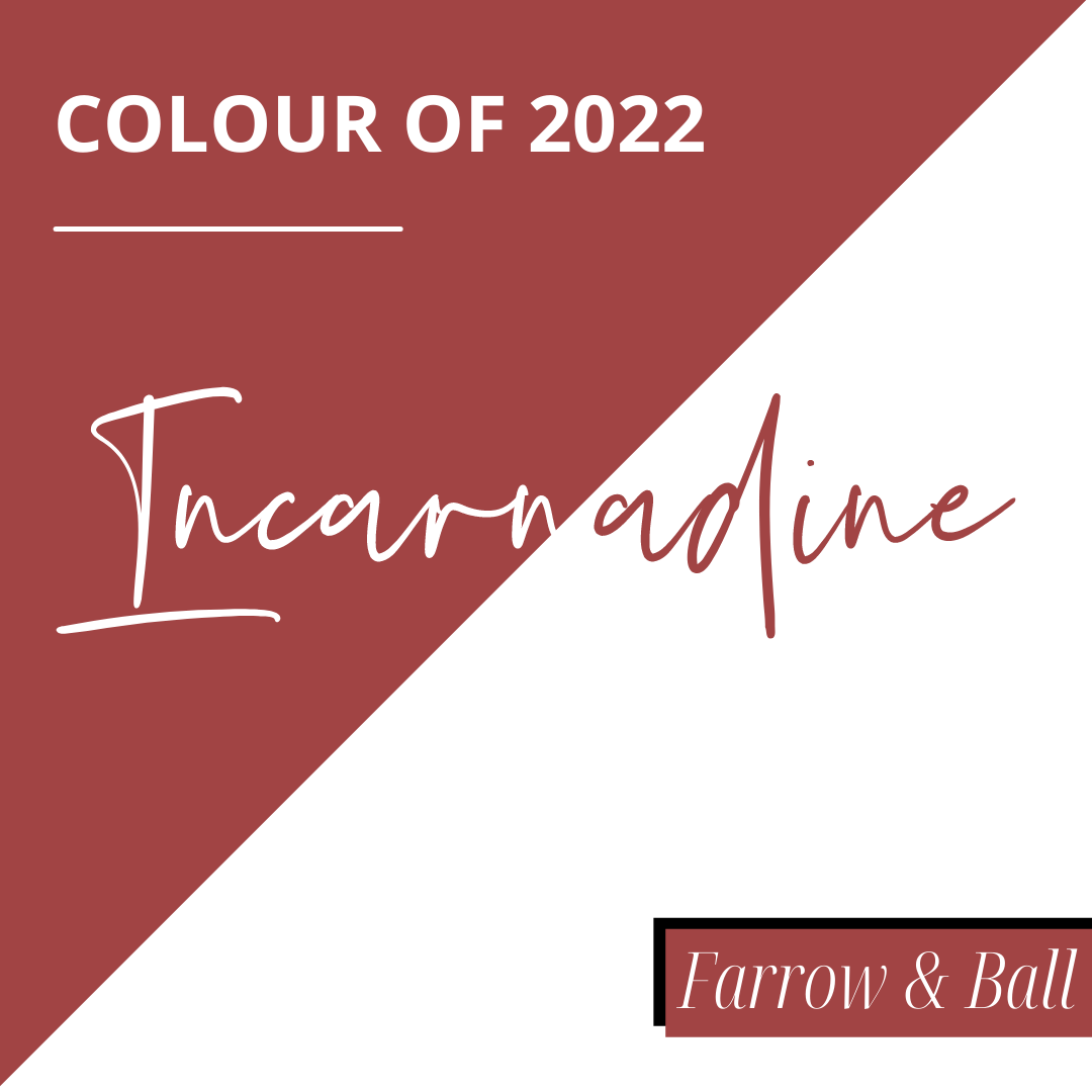
Incarnadine is a deep red without the startling effect of the primary shade. If you want a statement colour that respects a natural colour scheme, this is it.
Green envy
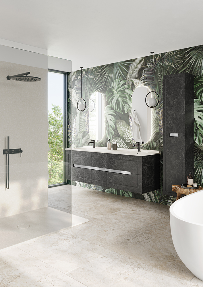
A fresh alternative to the browns and beiges of 2021 is green.
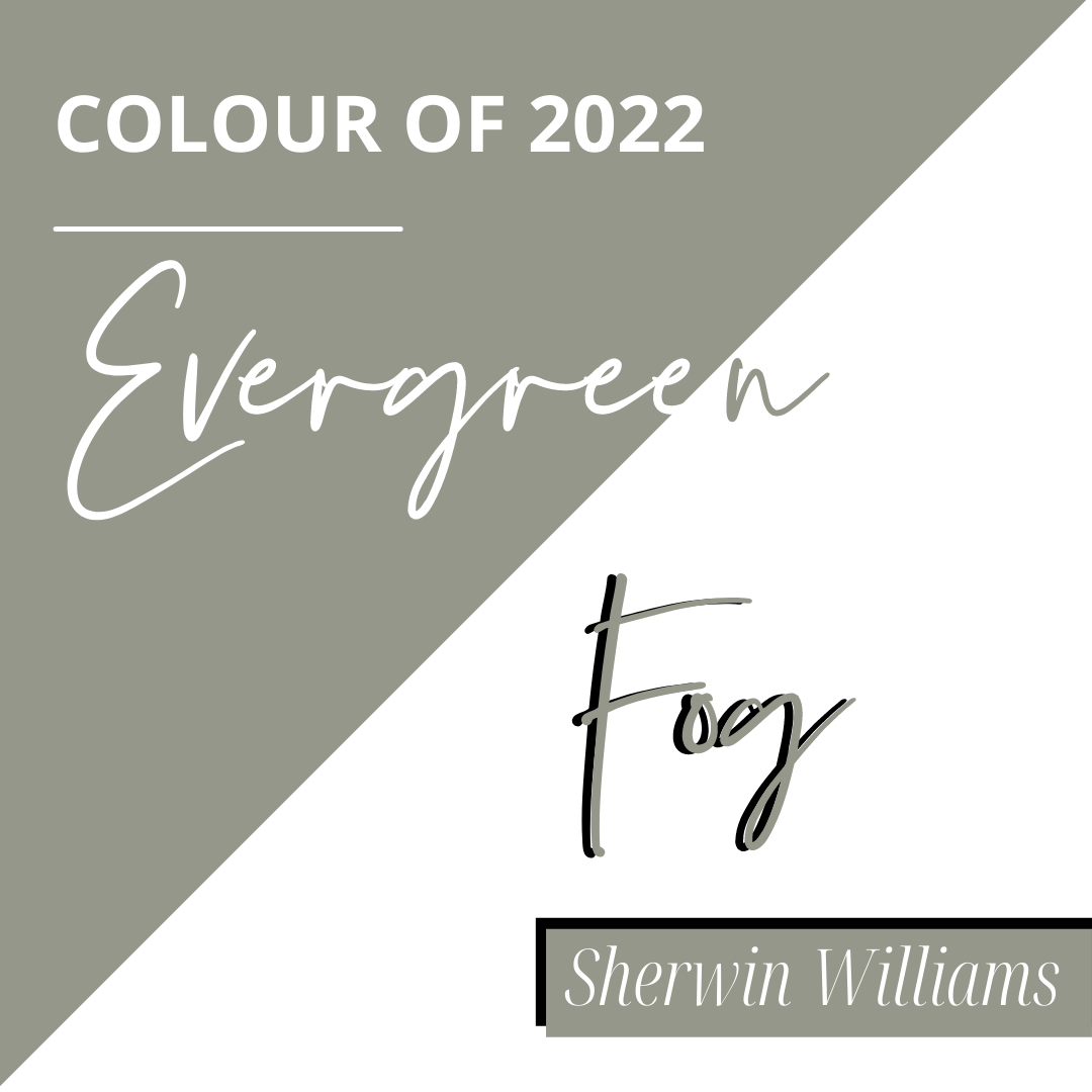
Subtle greens include Benjamin Moore’s October Mist and Sherwin Williams’ Evergreen Fog, while a stronger contender would be Farrow & Ball’s Breakfast Room Green.
Green goes well with blue and white, but becoming more and more popular is rosy pink.
Still keep it grounded
Brave Ground is still lurking in the background, but its more extroverted siblings are coming to the fore in the form of chocolate and caramel. If you’re going to do brown, do it with aplomb – that’s why we propose Safari or our new Cacao for your fitted furniture doors and panels. These beautiful brown and caramel tones look stylish when teamed with our Gloss White or Nougat worktops.
All white is gone
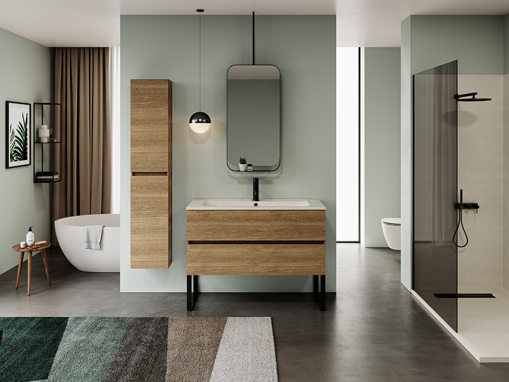
Finally, it’s time to say a few words of respect to our all-white bathrooms. While it’s served us well for many a year, it comes off as clinical and a bit cold. Instead, warm up your bathroom with beiges, greige or pick out one of the greens.
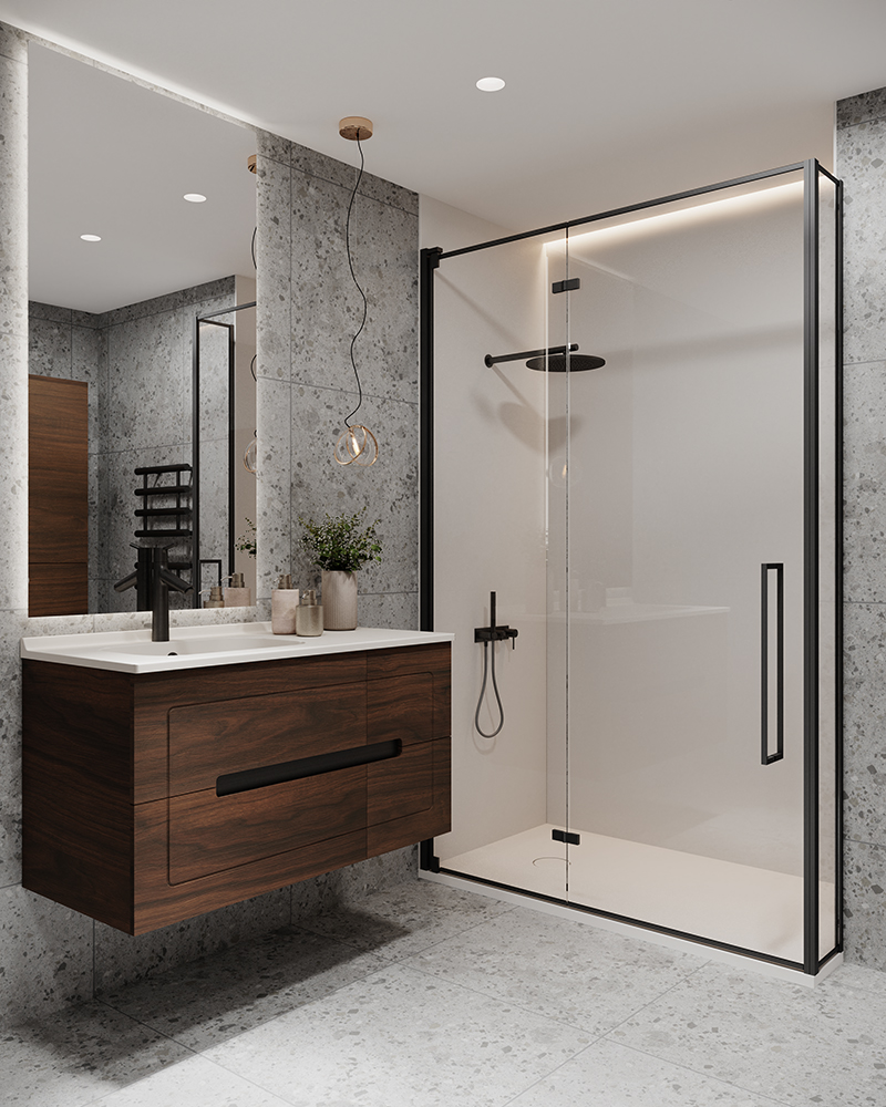
Alternatively, keep white but add in some stone texture for interest and pair it with brighter hues.
Has that whet your appetite for colour? Our furniture collections and shower spaces give you the widest bathroom colour options on the market. Why not see for yourself?
